Monday 28 November 2011

Internet Research: Conventions of a Music Video

KEY TO A SUCCESSFUL MUSIC VIDEO:
The main purpose of a music video is to promote a single or album released by an artist/band. If or when the music video is affective and appealing, the video is used as a marketing tool to gain album purchases, downloads, fans and popularity.As a result of a successful music video the artist/band will gain financial investment from their record label.

THE DEVELOPMENT OF MUSIC VIDEO'S:
Over time; music video's have become arguably less related to the songs themselves; some video's of the 21st century are not at all relatable to the song's title or the lyrical messages within them.  However, many artists still see a music video as a companion of the same importance as the song itself; one noteable music video that supports this is Taylor Swift's 2008 single 'LoveStory' which follows the same concept throughout the video from the lyrics; "it's a love story baby just say yes". The video follow's two protagonists in a romantic setting which is typically a video that is aimed at a target audience of teenage girls who dream about falln in love, similar to the events in the video. In my opinion, music video's should at least have some importance and relevance to the overall message of the song.

TYPICAL NORMS OF A MUSIC VIDEO:
  • Appearences from the artist/ band
  • Live performance from the artist/ band
  • Development of a narrative to make an impact on the audience
  • Relevant video and lyrical meanings 
  • Typical and relevant costume related to the video's target audience: nice clothes and make-up in relation to a female target audience who aspire to be like the artsist
  • Dance routines are very common in music videos of specific genres, mainly pop. It's also common that the artist(s) act in the video as characters as the narrative unfolds.
Conlucsion: 
  • There are no real set guidelines to a music video.
  • Trends within specific genres occur
  • Diverse 
  • Individual taste

Saturday 26 November 2011

Summary of Focus Group Research

I conducted focus group research on teenagers of my target audience. In terms of music video's, i found that a teenage related costume and bright colours help to make the music video more eye-catching and appealing. Members of the focus group seemed to prefer the technique of fast paced editing as apposed to slow paced; this is arguably because it relates to a teenagers fast paced lifestyle, we therefore ensured to make most of our video fast paced to add further appeal to the target audience. Findings from the focus group also highlighted that a variety of different locations are needed to keep the music video interesting; although the settings used need to relate to the teenage target audience and the narrative of the video. Special effects also seem to be favoured, such as; animation, text overlay and references to social networking sites which gives a fun, teenage related appeal to the music video. Finally teen related props seem to have a good influence on the success of the music video, such as; mobile phone's, speaker's and iPod's; all of these items are in coherence with 21st century teenage culture. Also, the findings showed a different variety of locations are needed to keep the music video interesting; although the settings used need to relate to the teenage target audience and the narrative of the video. Special effects also seem to be favoured, such as; animation, text overlay and references to social networking sites which gives a fun, teenage related appeal to the music video. Finally teen related props seem to have a good influence on the success of the music video, such as; mobile phone's, speaker's and iPod's; all of these items are in coherence with 21st century teenage culture. 

In terms of album cover's i found that the type of camerawork preferred by members of my teenage focus group was a close up shot showing the artist's face so the consumer can identify with the artist. Also, a successful album cover appears to need a bold, eye-catching title to stand out from the product. The font style also needs to be appealing to the target audience of teenagers depending on the album genre.

In terms of album advert's i found that members of my focus group like a mid shot image of the band featured in the center of the advert or an image of the album cover itself; i took this into consideration when producing my ancillary product using an image of the band in the advert. Also, a successful album advert needs to include a one liner crtical review from another established newspaper or magazine that would feature the advert. The feature of weblinks, to the band's site is also a major convention of album adverts as it allows the reader to find out more about the band after seeing the advert in the magazine. Also, a typical feature is a release date as this tells the reader when they can purchase the album or download it online; i have incorporated all of these preferences when producing my own album advert.

The focus group research has allowed to personally find out what members of my teenage target audience expect and prefer in each of my products and has enhanced the success and appeal of my promotional package as a whole.

Friday 25 November 2011

Focus Group Research Six: 'Florence & The Machine - Ceremonials' Album Advert


  1. Works well in this album cover?


  • Stylish typography "CEREMONIALS" written in a eye-catching regal kind of font.
  • Mirror image; typical of Florence's unconventional style which is reflected on the album cover
  • The release date of album appears on the cover which helps the teenage target audience to identify with when the album is set to be released and is a conventional feature of typical magazine album adverts.
  • The weblink enables fans of the band to gain more information about tour dates, merchandise and music videos which is a typical convention of album advertisements.
  • The record company label is placed in the terminal optical area of the page in the bottom right corner as it is not the most significant item however it does allow readers to access more albums from different artists in the same 'Island' label.
  • A brand identity is established through using the same typography for the artists' name as on her debut album cover; this is conventional as the artist can be easily identified trough the use of continuation. 
  • The artist; Florence is wearing make up and her costume is a silver, sparkly dress - this emphasises the singer's femininity and enables the female teenage target audience to copy her style. 
  • Mid shot image related to the album title 'Ceremonials' as she looks glamorous and dressed up
2. What does not work well?
  • Slightly boring - not much of a narrative, doesn't look very happy.
  • Florence isn't really showing any emotion as her eyes are closed 
  • The message behind the cover is quite ambiguous and difficult to understand. 

3. Does it make you want to buy the album?
  • No as the cover isn't very eye-catching and can be further criticised for not showing a clear narrative.
  • Wouldn't buy the album based only on the front cover; prefer to listen to the songs first.

Focus Group Research Five: 'Klaxons - Surfing The Void' Album Advert


  1. Works well in this album advertisement?
  • Very unconventional image of a cat in an astronaut costume; this could be related to the album title 'Surfing The Void' as the 'Void' may be meant as anything the target audience wishes it to be and the cat is just one possibility. This choice of "random" use of mid shot image would appeal to fan's of the band as the 'Klaxons' music is quite unconventional and is almost psychedelic and so the image fits the band's musical and visual style.  
  • The typography of the band name 'KLAXONS' is written in an archaic font style (possibly anglo saxon). Also, this choice font is a continuation of the band's name on the previous album which helps to form a sort of brand identity; this further allows the band's albums to be easily identified by the teenage target audience. 
  • There is use of an effective colour scheme as the bright yellow in the terminal optical area of the page is eye-catching and stands out from the album advertisement.
  • The use of the cat dressed in an orange astronaut costume is effective as it is not something the teenage target audience will see every day on an album cover. This is possibly the appeal of the band as they use random, thought provoking visuals to compliment their unconventional musical style. 
  • There is a one line critical review at the bottom of the page from an established music magazine industry; NME. This is conventional of most album advertisements that feature in music magazines as they allow the teenage target audience reader to make a judgement about the appeal of the album through a review from an established industrial music magazine as the reader is aware of the style of music the magazine advertises and whether it will be appealing to them. The choice of informal, colloquial language further relates the album advertisement to it's teenage target audience; "comeback, anticipated & pop" are all used to ultimately sell the album to the teenage target audience who are knowledgeable of the music industry. 
  • The phrase, "Out Now" is also employed to allow the teenage target audience reader to be aware that they can now purchase the album and is a conventional feature of all album advertisements in visual and print media to establish a release date. 

2. What does not work well?
  • If the teenage target audience reader were unaware of the band's style then the use of image on the album advert would not make any sense to the reader which would cause a loss of appeal. However, as the album advertisement is printed in a well established music magazine (Q), the teenage reader are most probably familiar with the band and their musical and visual style. 
  • A lack of information to promote the physical release of the album as it does not detail any of the tracks featured on the album. 
  • The composition of the album advertisement is quite unconventional of most layouts as the mid shot image of the album is taking up three quarters of the advert. This compromises the significance of the band itself and the album title as usually the name of the band is placed in the primary optical area of the page in the centre and is the first feature seen on the advert which is more typical and enables the reader to identify with which band's album they are reading about. 
3. Does it make you want to buy the album?
  • No as it doesn't really advertise the album concept or the tracks featured, however the use of a cool, funky poster may attract some musically intelligible teenage readers who are keen to find out bout genre breaking new music. 

Thursday 24 November 2011

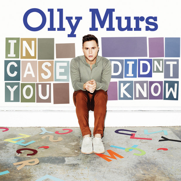
Focus Group Research Four: Album Cover Analysis 'Olly Murs - In Case You Didn't Know'


1. What works well in this album cover?

  • The typography (font and letter) style appears like a stencil in a sketchbook which is related to the teenage target audience.
  • The artists' name appears in the primary optical area of the page in the center which creates a good cover composition which is a conventional layout of most conventional pop album cover's.
  • Eye-catching & bright colour scheme which would stand out in a music shop; also the use of vibrant colours on the cover is similar to the artists visual imnagery in his music video's.
  • The house style of 'Olly Murs' shows continuation as it is featured on all of the artists' single and album covers which creates a type of brand image.
  • The use of mise-en-scene through costume is easily relateable to the teenage target audience of males who see 'Olly' as having a good style who choose to dress similarly in chino's and shirts. The image also appeals to the female teenage target audience who have a crush on the the artist.
2. What does not work well?
  • The text seems to take up most of the album covers' composition and draws the attention away from the actual imaghe of the artist which should be the most important item on the cover.
  • The artist 'Olly' appears insignificant to the overall layout of the page as it seems as though he has just been squished in.

3. Does it make you want to buy the album?
  • No - slightly irrelvant to music itself as it's just a man sitting down which has no importance to the album concept.

Focus Group Research Three: Album Cover Analysis 'Rihanna - Talk That Talk'


1. What works well in this album cover?
  • Close up shot showing the female singer wearing lipstick and eyeliner to show her femininity and relate to a teenage target audience.
  • Text of logo "R" adds to the front cover's effect and the style is in a newspaper print and so relates to the title of 'Talk That Talk'.
  • Rihanna's facial expression appears to be feisty, provocative and the licking of the lips is used to attract the male teenage audience.
  • The font is nice and eye-catching as it's shiny and glittery and could be related to a female arge audience.
  • The use of the tatoo is a clever, unconventional way of promoting the album although it could be improved by being written in a larger font.
  • Mise en scene of silver rings are used to relate to the female teenage target audience as he style and music fit in with her target audience.
2. What does not work well?
  • Slightly bland album cover; no real detail just a picture of a crazy looking woman
  • The choice of costume is poor as she looks as though she is wearing a cow printed top which has nothing to do with the album concept or title.
3. Does it make you want to buy the album?
  • No, not on the basis of only the album cover as the image isn't really related to the album title.
  • The cover doesn't look very welcoming and appears quite "odd" rather than typically controversial.
  • No as Rihanna looks angry, annoying and appears as rude.

Monday 21 November 2011

Focus Group Research Two: Sean Kingston 'Party All Night'


1. What stands out to you from the music video?
  • Comic book font showing song lyrics relating to teenagers 
  • Teenager related costume - hi tops/ baseball jackets - youth fashion 
  • Good use of location - house party - related to teens 

2. What do you think works well?
  • Circular narrative - wake at 10 then party then sleep at 10 - constant teen partying 
  • Slow motion effect - freeze time at party to break up narrative and emphasises the drama
  • Link to 'The Inbetweeners Movie'; song featured in the film - increases the songs popularity as film and song are both related to a teenage target audience 

3. What could be improved with this music video?
  • Better colour scheme as mostly dark and yellow - more silver and gold 

4. Does the music video appeal to you as a teenager?
  • Yes - teenagers like to sleep all day and party all night

Saturday 12 November 2011

Focus Group Research One: Cher Lloyd 'Swagger Jagger'

I gathered a small group of teenage students that would be my target audience to find their views on existing music videos, album covers and album poster adverts. I have conducted this "Focus Group" research in order to help me to create a relateble, apealing and conventional product for my main tasks.


1. What stands out to you from the music video?
  • The colours and costume stand out as they are bright and eye-catching
  • The video is fast paced and can be related to teenagers. 
  • Cher's costume is fitting to the song as it says "Swagger Jagger" 

2. What do you think works well?
  • Different locations to relate to different parts in the song; club area with teens partying. 
  • Special effects through animation to relate to a young audience but sometimes over exaggerated. 
  • Many teen related props and costume - mobile phone's, speakers, hi tops, chinos & hoodies 
  • Use of social networking sites in the song - "you can't stop you tubing me, tweeting me"- relatable to modern teenage audience 

3. What could be improved with this music video?
  • More of a narrative story related to the song as it seems slightly random. 
  • The ending as Cher's just walking down the street on her own after partying with loads of teens; this emphasises the fact that the events in the video are not real and is represented through a dream. 
  • The video could be more grown up as it seems quite childish just dancing and partying

4. Does the music video appeal to you as a teenager?
  • No - childish animation,  minimal narrative 

Thursday 10 November 2011

Target Audience Research Questionnaire & Analysis


Create your free online surveys with SurveyMonkey, the world's leading questionnaire tool.


From producing my questionaire I have found that the target audience demographic is a mixtue of both males and females. The average age of my target audience is beween 16-18 years old and therefore our aduiovisual main task must appeal to this age category. Thirdly, I asked the question; what genre of music do you listen to most? The responses recieved conclude that the most popular genre of music is Indie with 66.7% which was closely followed by 60% for both Pop and R 'n' B music. These three genres of music have connotations with teenagers and for example; teenagers who are into Indie music are identified as a subculture through their choice of clothing (check shirts and chinos) and interests; going to music festivals. The emergnence and combinaion of club/ dance/ electonic; bass pounding music has in the last year formed Dubstep which recieved 46.7%. This style of music is clearly associated with teenagers who enjoy clubbing and partying at the weekend. The fourth question that i asked was; do you read any music magazines? Suprisingly, 86.7% of the responses given were no; this was not the result i was expecting to get from the teenage demographic as myself being a teenager am subscribed to NME magazine and Q magazine. I then asked the target demographic what music channells do you want? The two most popular were Kiss and Viva with both having 50%. This result is conventional as the music that is played on these channell's is mainly Pop, R'n'B and Dance music which would therefore agree with the results of which music genre the target audience preferred. The third and fourth most popular were Chart Show TV and 4 Music with 42.9% of the vote; these channells also follow the conventions of the type of music to be aimed at the teenage audience of Pop and R'n'B. The joint least popular music channel's were Magic, Kerrang! and Scuzz. Magic is aimed at an adult demographic as they play "easy listening" and classical music which is not associated as popular with most of the teenage demographic. On the other hand, Kerrang! and Scuzz mainly play heavy rock and metal music and would be less appealing to the general teenage demographic and would only be popular with certain types of people who identify themselves as subcultures by dressing in a certian way and having certain interests. The sixth question i asked was how often do you watch music channells. The top response was Monthly with 40% which shockingly suggests that some of the teenage demographic do not bother keeping up to date with new music which seems suprising to me. The seventh question i asked was to do with the technical aspect of our main task; producing i music video. I asked what length of music video do you prefer and 80% of the results gained were 3-4 minutes long. When producing my music video; i have taken this preference into account as if a music video is worth producing then i also believe that it should be of a conventional length and be worth watching as a mini - movie. The eighth question i asked was which radio station my target demographic of teenagers listen to; both Radio One and Kiss recieved 33.3% of the vote. I was unsurprised by this as these radio stations play the most up to date, mainstream and chart friendly music which teenagers like myself are interested in. Heart radio also recieved 26.7% of the vote which also plays mainstream music as well as songs from previous era's, such as; the nineties and the eighties and has become a popular radio station with teenagers. The ninth question that i asked my target audience to answer was "What attracts you to CD covers?". I asked this question in order to increase the appeal of my own CD cover when producing my ancillary task. Some of the responses that i recieved included; "bright colours, band name, a good image, a good design, band logo's and a catchy title. When producing my own album cover i will take these responses into account in an attempt to meet the preferences and increase the appeal of my product to the target audience. The final question that i asked was; "What do you expect to see from a music video?" I asked this question in order to increase the appeal of my own music video when producing my audiovisual main task. Some of the responses i recieved included;  "dancing, catchy music, good lyrics, relevance, a story related to the song, the band playing in a set location, great camerawork and production value". The response that i found most helpful was "a story related to the song"; therefore when producing my music video i will create a developing narrative that fits the song's lyrics and is interesting and entertaining for my target audience of teenagers to watch.

Music Magazine Album Advert: Analysis Three "The Gaslight Anthem"


Music Magazine Album Advert: Analysis Two "Funeral Party"


Music Magazine Album Advert: Analysis One "The Vaccines"


Monday 7 November 2011

Album Cover Analysis Three: Example - 'Playing In The Shadows'

The title of the album ‘Playing In The Shadows’ is clearly represented in the image on the album cover as half of the artists face is shadowed with a white background and the other half is bright on a black background. This could be suggested to represent the artist trying to convey two seperate personalities or how since he has become well known in the music industry he has come from out of the shadows of being unknown to being recognisable artist. The artists; name 'example' is printed under the image of the artist's face and follows a sort of brand logo that  features on all of examples albums. Through using the same text style and font colour, 'example' creates a sort of continuity that enables the teenage target audience to identify with his music as it is easily located. The layout of the album cover is highly conventional as the image is placed directly in the center and the artist's name and the album name are placed underneath. The artist,, 'example's target audience is the teenage demographic as he sings about falling in love, partying and his music video's feature live concerts. These are emotions and activities that the teenge listener would be able to relate to as they are notable, common conventions of the teenage lifestyle. In terms of camerawork, the image is a mid close-up focusing on the artist's face which allows the teenage audience to identify with what the artist looks like if they were to see them on a television programme or in a music magazie. In the bottom right corner of the album cover their is a "parental advisory" logo which details that the album may contain sexual references or offendable language; this warning features on all albums that contain innapropriate language, although  these are still targeted to the teenage demographic.

Album Cover Analysis Two: Cobra Starship 'Good Girls Go Bad'


This single cover can be easily related to the teenage target audience and gives a negative representation of young people in the music industry. The name of the band ‘Cobra Starship’ is printed in a large, bold font that stands out on the cover and is placed in the bottom of the terminal optical area; this emphasises the importance of the band’s name in the overall effect of the single cover.

The supernatural/ animalistic font used is relatable to the ‘Cobra’ name of the band as the writing looks as though it is scratched and embossed into the cover. The image on the cover is of the lead singer of the band lying on a toilet floor; most probably after a night out partying; this image is therefore representative of teenagers that are constantly partying, drinking and generally having a good time.

The decision to have the location of the image in a toilet is relatable to house parties or nights out where teenagers are portrayed as constantly drinking and consequently being sick which is seen through the toile basin and the loo rolls. This further proposes that teenagers are unable to handle their alcohol and this image is a portrayal of the state drinking get’s modern teenagers into. It also appears as if the female in the image is sitting on the toilet whilst drawing on the lead singer in permanent marker; this is representative of party chaos that often ensues within teenage parties.

From following the “rule of thirds” the lead singer’s face is seen in the centre of the image conflicting with the neon green female shoe; making the album cover accessible to both genders; male and female. The costume worn by the lead singer on the floor is of casual party wear – a check shirt and patterned t - shirt which is a costume that is relatable to the teenage target audience. The overall layout of the cover is conventional in it’s layout and typical image used to relate to teenagers.

Album Cover Analysis One: Rizzle Kicks 'Stereo Typical'


The title of the album ‘Stereo Typical’ is challenging social stereotypes; presumably adults misconceptions about teenagers. This is related to the teenage target audience who also suffer then same negative stereotypes that they are unintelligent, useless and a burden to society. The title is split in to two as “Stereo” is relative to the music industry as this is the item music is sometimes played out of. Also, the background of the title is written on a page of the type of notebook students use – this further relates it to the teenage target audience. 

The image used is a mid shot which shows both members casually sitting down; this connotes a relaxed sense to the teenage target audience. The costume chosen also gives  a carefree and relaxed attitude to the album cover as the singer’s are wearing plain grey hoodies with minimal white t shirts – this type of clothing is often associated with lazy and stereotypical teenagers. This casual implication is also furthered by the vacant look on the artists’ faces; which is possibly used as a portrayal that teenagers are unfairly misjudged as unintelligent layabouts by challenging the stereotype. 

Following the principle of thirds theory; both singer’s faces are placed directly in the centre of the cover which emphasises their importance on the album cover. The use of a plain background of white gives the idea of a “blank canvas” for the artists to use their imagination by creating songs that are relatable to the average teenager. 

The overall layout of this album cover is conventional as it firstly gives the name of the band and then the album title, below this is an image of both singer’s in the band which is the first item from the cover that is seen by the viewer from the “route of the eye”.